One of the big mistakes that people make with PowerPoint is that they just dive right in, and start trying to match up the content of their slide with images, animations, transitions and effects. Each slide becomes a slow slog, and the author is exhausted by the time the process is complete.
Try out this Best Practice to make your presentation much easier to produce.
One of the big mistakes that people make with PowerPoint is that they just dive right in, and start trying to match up the content of their slide with images, animations, transitions and effects. Each slide becomes a slow slog, and the author is exhausted by the time the process is complete.
Best Practice Hint: Separate your content from design!
What that means is that you should write your presentation before you design it. After all, until you have the content, you don’t really know the design “feel” that the presentation needs to have.
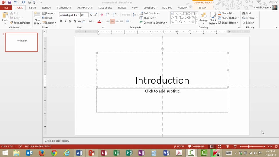
The easy way to do that is to use the Outline View in PowerPoint.
- Click View Presentation Views Outline View.
- Observe that the Outline Pane changes from a box view of your slide to a bullet list.
- Click your mouse at the end of a slide and press Enter to add a new slide.
- Press Tab after you press Enter to indent text beneath a previous slide.
- Press Shift-Tab to move a line of text to a new slide.
- Click View Presentation Views Normal to return to the previous view of the Outline Pane.


