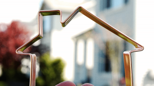
 This is a quick one for a Friday afternoon, but have you ever noticed how many websites are doing away with the home button? CDAComputer.Tips is still using a home button as of this writing, but the sister site CDAComputer.Training is not.
The fact is that web designers have been making the company logo a link to the home page for so long, that most savvy users have caught on. Believe it or not, those wily designers have been tracking which you prefer to click on, and finding that most people are using the company logo as a home button. That frees up space in menus, and trusts you the reader to have a better sense of what’s going on.
What do you think? Should we get rid of Home buttons forever, or should they be a requirement for good website design?


