 Features that make computer software accessible are often over-looked by mainstream bloggers because they don’t understand them. People who work with the disabled, and those who work for organizations that want to communicate with them, however, know that this is the place where we need to put our strongest efforts.
Like most people, I hadn’t thought that much about accessibility until I started researching the topic for a class I was asked to write. The numbers were pretty astounding.
Millions of people depend on some form of accessibility to access the world around them. Microsoft has been working diligently to make their programs easier to use for people with disabilities, and to make it easier for authors to share their work with people who are disabled.
Office 2016 contains three new features that will help people with disabilities use the software…
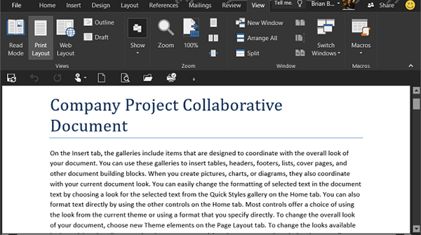
Dark theme
Though many people think in terms of blind people when they speak about accessibility, the fact of the matter is that many people are only partially-sighted or they are color-blind. For these people who may not need a screen reader, the option to increase background contrast is critical.
Users with these types of disabilities found the bright screens of 2013 unusable, so Microsoft has offered the new Dark Theme as standard in Office 2016. The theme also addresses Word’s Navigation Pane (better readability, fixed white flashes) and Outlook’s ongoing issues with readability. Also new in Office 2016 is the fix that will improve the readability of “contextual ribbon tab text, hover states and task pane controls,” according to the Microsoft website.
Keyboard access increases in Excel
People who have taken my classes or read my blog know that I am a big fan of keyboard shortcuts for everyone. For people who are blind or disabled, keyboard access can be the only type of access they have.
Office 2016 includes several fixes that will add keyboard access to Pivot Tables and Slicers in Excel. These objects in Excel were previously blocked from keyboard access, so their addition speaks well to Microsoft’s intentions toward the accessibility-using community.
Keyboard access increases in Visio, too
Not installed with every version of Office, you’ll know about Visio if you use it. The software is used predominantly by people who need it to make flowcharts, organizational charts and network diagrams. As you can guess by the description, these type of projects use lots of shapes, but the Shapes panel was not previously available for keyboard access.
Disabled users can now access the Shapes panel by pressing the F6 key, and the use of the Tab key will cycle them through the different stencils. Microsoft also promises that “Arrow keys [will] allow users to navigate between the individual elements. Ctrl + TAB will allow users to quickly switch between STENCILS and SEARCH views.”
Accessibility isn’t just the law, it’s the right thing to do
If you don’t know much about accessibility, stay tuned to this blog or check out my Accessibility class. Many documents are required to be accessible by parts of the Americans with Disabilities Act (ADA), but communication shouldn’t be limited by the technology we use. Spread the word about accessibility!
Image Credit: Groovy Post


